Table of Contents
“Walls speak the language of culture, craft, and personal style.”
You finally decide to refresh your home. Maybe it’s a new paint job, maybe a full makeover. But then comes the confusing part. Too many shades, too many opinions, and suddenly choosing colours feels harder than it should.
Many homeowners rush and pick colours quickly, only to feel later that something looks off. The room may feel dull, too bright, or just uncomfortable. That’s why understanding the best colour combination for house interior is important. This guide will help you choose colours that feel right, look balanced, and match your everyday life without stress.
By the end of this blog, you’ll know how to pick colours that suit your rooms, your furniture, and your lifestyle, without second-guessing your choices.

Why Choosing the Right Interior Colour Combination Matters
Colours are not just about looks. They quietly affect how your home feels when you walk in after a long day.
Shades on your walls can make a room feel calm or restless. Soft tones often help you relax, while strong shades can add energy. Even small colour changes can make a room look bigger or slightly tighter.
When colours across rooms feel connected, the house looks planned and peaceful. Otherwise, each room starts looking like a different story. That’s why designers always focus on finding the best colour combination for house interior before anything else.
How to Choose the Right Colour Combination for Your Home Interiors
Choosing the right colours can transform your home. A well-planned palette makes rooms feel harmonious, comfortable, and visually appealing. Here is a clear, step-by-step guide to help you pick the best colour combination for house interior.
1. Start with Your Home’s Overall Style
Every home has a style, whether modern, traditional, or minimal. Understanding it helps you pick colours that complement rather than clash. Look at your furniture, flooring, curtains, and lighting to guide your choices. Wooden furniture and warm lighting suit earthy tones like beige or terracotta. Sleek, minimal spaces work better with light or neutral shades. Matching colours to your home’s style makes the space feel intentional and cohesive. Pause to observe your home before picking paint samples to start with clarity.
2. Understand Basic Colour Combinations
Knowing how colours work together prevents mismatched or overwhelming spaces. Colours next to each other on the wheel create calm and harmony. Opposite colours add contrast and energy. Using shades from the same family gives a smooth, cohesive look, while mixing very different colours requires balance. Learning these basics makes it easier to select the best colour combination for house interior confidently.
3. Follow the 60‑30‑10 Rule for Balance
Too many colours can make a room look chaotic. The 60‑30‑10 rule keeps things balanced. Use one dominant colour for most of the space, a secondary colour for furniture or textiles, and a small accent colour for décor items. This simple structure ensures the room feels balanced and visually appealing. Following this method helps you achieve the best colour combination for house interior without guesswork.
4. Decide the Mood for Each Room
Each room has a purpose, and colours should reflect it. Living rooms work best with warm, welcoming shades, while bedrooms benefit from soft, restful tones. Kitchens feel lively with fresh colours, and study areas need neutral shades for focus. Choosing colours based on function ensures comfort and practicality. This is an easy way to create the best colour combination for house interior for your daily life.
5. Balance Warm and Cool Tones
Mixing warm and cool tones makes a home feel inviting and balanced. Warm colours like beige or soft yellow add coziness, while cool colours like blue or grey bring calmness. Even small touches of these shades in décor or walls create harmony. Balancing tones ensures your rooms feel pleasant all day and supports the best colour combination for house interior.
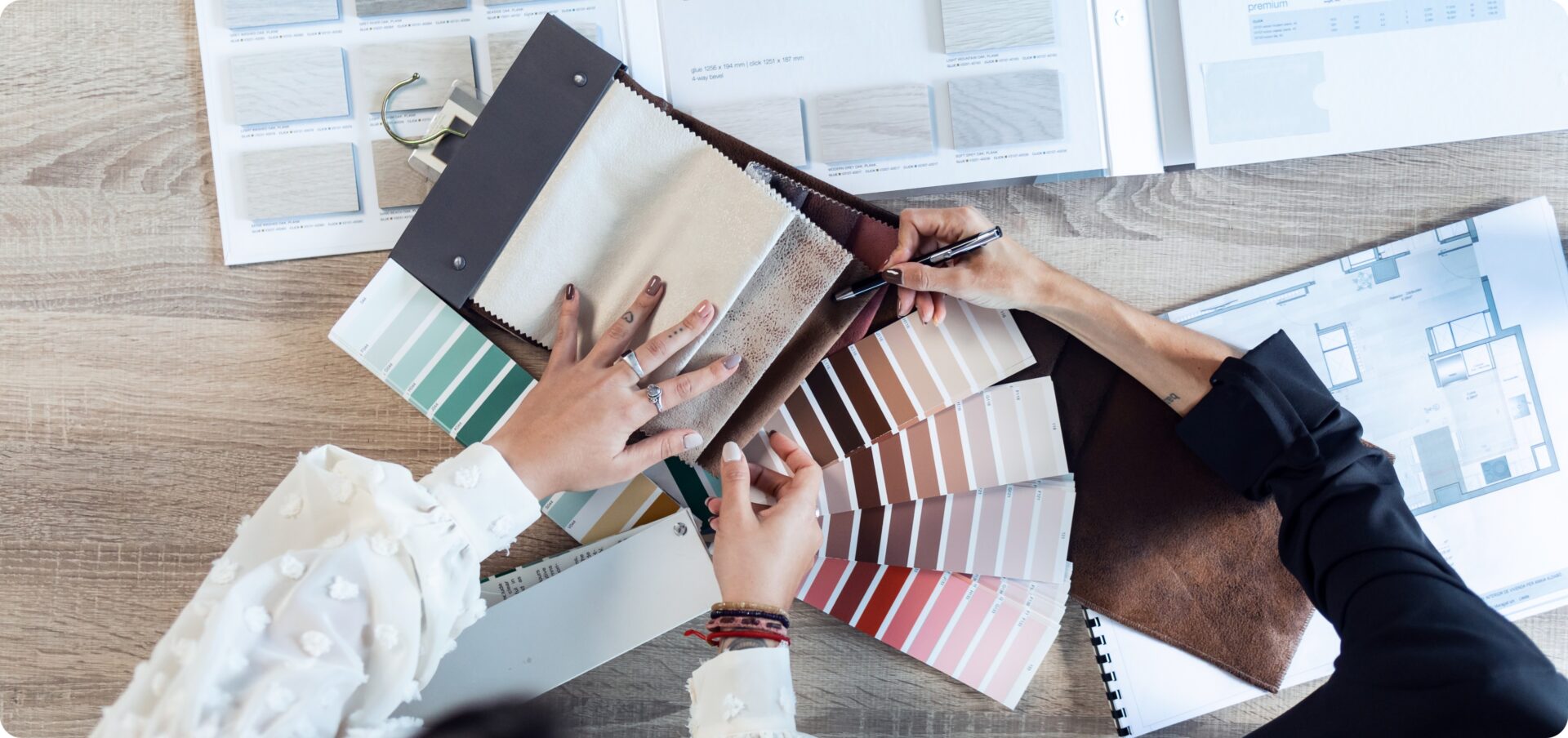
6. Check Undertones Before Finalising
Similar shades can look very different on walls due to undertones. Each colour has a base that can be warm, cool, or neutral. Compare paint samples with your flooring, furniture, and curtains to avoid mismatches. Checking undertones ensures the colours suit your space and helps achieve the best colour combination for house interior. Testing samples is a small step that prevents costly mistakes.

7. Maintain Colour Flow Across the House
A smooth colour flow makes your home feel connected and harmonious. Repeat a base colour or similar shades across rooms, and use accent colours strategically. This creates visual continuity and makes moving between spaces feel natural. Maintaining flow is key to finding the best colour combination for house interior that looks intentional and cohesive.
8. Test Paint Samples Before Committing
Paint can look different at home than in a store. Apply small patches and check them in natural and artificial light at different times of the day. This helps you see the true shade and ensures your choice works with the space. Testing paint increases the chance of selecting the best colour combination for house interior without surprises and saves time and money.

Popular Colour Ideas for Indian Homes
Indian homes often have similar layouts and lighting, so certain colour palettes work particularly well. Here are some tried-and-tested combinations for different spaces:
- Cream or beige walls with wooden furniture for a warm and cozy feel.
- Soft grey walls with pastel accents like mint, blush, or lavender to make smaller spaces look airy.
- White walls with pops of teal, mustard, or coral for a modern, stylish touch.
- Blue walls paired with white trims for a calm and timeless look.
- Light green or olive shades with neutral décor for a natural, refreshing vibe.
- Soft peach or warm yellow with beige elements for bright and inviting living areas.
The right colours can make your home feel warm and inviting. Choosing thoughtfully helps you find the best colour combination for house interior that suits your style.
Common Mistakes to Avoid
Even carefully chosen colours can look wrong if details are ignored. Here are the common mistakes to watch out for:
- Choosing colours directly from catalogues or online images without testing them in your home.
- Ignoring how lighting affects the colour, which can make shades appear darker or different than expected.
- Using too many bold colours in a small room, making it feel cramped and cluttered.
- Not matching wall colours with furniture, flooring, or décor, which can disrupt the room’s harmony.
- Rushing the process without observing samples, which can lead to regret and repainting later.
If you take expert help from Designs Palette, you can avoid these common mistakes and easily choose the best colour combination for house interior that truly suits your home.
Conclusion
Choosing colours isn’t just about following trends or looking at catalogues. It’s about how your home feels every day. When you consider mood, lighting, balance, and flow, making decisions becomes much easier. Your space starts to reflect your personal taste naturally, and each room begins to feel comfortable and complete.
If you want expert guidance without any stress, we at Designs Palette can help. We understand how you live, what suits your home, and how each room should feel. With our perspective, we can help you create interiors that feel just right, every single day.
FAQs
How do I know which colours will look good in my home before painting?
You can start by testing paint samples on your walls and observing them at different times of the day. This way, you’ll see how your lighting affects the shades and confidently pick the best colour combination for house interior.
Can I mix warm and cool colours in the same room without it looking odd?
Yes, you can! Start with a dominant colour you love and add touches of the other tone through décor or accessories. This helps you balance the room and create a look that feels harmonious and inviting.
How can I make small rooms feel spacious with colours?
You can make your room feel bigger by using light shades like cream, white, or soft grey on walls. Pair these with subtle pastel accents in your furniture or décor to keep your space airy and comfortable.